
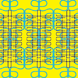
This Pattern was created using the same "architecture" serif font as was used in one of my previous posts. I transformed the "a" and the "t" in this pattern. The "a" was copied and rotated to connect the arms, then reflected as a group and lined up along the backs of the "a". That whole Group was then rotated 180deg. again and lined up along the feet of the "a"s. This grouping was then dupicated and repeated, then scaled up so it fit the entire page. I decided to have the letters bleed off the sides to suggest a horizontal continuation of the pattern. The "t" was handled similarly to the "a." The letter was first reflected and connected at the crosses, then that shape was rotated 180deg. and connected at the tops/bottoms. I then took the two "t" group which was joined at the crosses and rotated it in two copies, 90 deg. and 270 deg. This was then connected to the outside of the crossbars of the upright "t"s. This pattern was again copied and repeated vertically. I scaled this to fit inside of the boundaries of the existing "a" pattern and copied that three times so that it would progress, again, horizontally across the page. This pattern also bleeds to the left and right, reinforcing the feeling of horizontal continuation. With the colored pattern I was able to use a different fills in order to differentiate these patterns. I felt that with the black and white they blended together more into on pattern and I was able to use the color in the fill to illustrate the layers of the pattern while still using the stroke to illuminate the individual letter that the pattern was made up of.

 This Pattern was created using the same "architecture" serif font as was used in one of my previous posts. I transformed the "a" and the "t" in this pattern. The "a" was copied and rotated to connect the arms, then reflected as a group and lined up along the backs of the "a". That whole Group was then rotated 180deg. again and lined up along the feet of the "a"s. This grouping was then dupicated and repeated, then scaled up so it fit the entire page. I decided to have the letters bleed off the sides to suggest a horizontal continuation of the pattern. The "t" was handled similarly to the "a." The letter was first reflected and connected at the crosses, then that shape was rotated 180deg. and connected at the tops/bottoms. I then took the two "t" group which was joined at the crosses and rotated it in two copies, 90 deg. and 270 deg. This was then connected to the outside of the crossbars of the upright "t"s. This pattern was again copied and repeated vertically. I scaled this to fit inside of the boundaries of the existing "a" pattern and copied that three times so that it would progress, again, horizontally across the page. This pattern also bleeds to the left and right, reinforcing the feeling of horizontal continuation. With the colored pattern I was able to use a different fills in order to differentiate these patterns. I felt that with the black and white they blended together more into on pattern and I was able to use the color in the fill to illustrate the layers of the pattern while still using the stroke to illuminate the individual letter that the pattern was made up of.
No comments:
Post a Comment