Tuesday, September 27, 2011
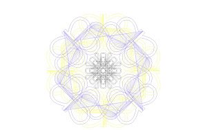
The Pattern I used from last week's exercise was translated from the original before this weeks project was begun . Instead of repeating the pattern as was done before, I took the base grouping of the translated letters and rotated them about a central axis. The resulting pattern was much more dynamic than the original pattern with much more overlap and complexity. That modified pattern is pictured here at the left. My 3D translations were a result of analyzing the layers that were created in the new pattern and extruding them to different heights in order to accentuate both their importance and to create a balance between them. For example the two layers making up the outside pattern are far larger than the two patterns making up the interior pattern. In order to balance the composition then I gave them lower heights as 3D extrusions and gave the two center layers higher heights in order to give them a greater importance despite their relatively small size in pattern. By using this system of extrusion there was also a compositional hierarchy and flow to the 3D pattern and that was further reinforced by the color scheme. The color scheme was taken from the last exercise and modified so that the layers would read well. The background was kept white and the colors get darker as they ascend, going from yellow to blue to black. I chose to keep both interior layers black in order to limit the color palette and reduce confusion within the pattern. I gave all of the surfaces reflective qualities, the yellow and blue being chrome finishes, and the black being a glossy finish texture. This made it so that the light source would show the curves and shadows more effectively. I also was required to add an extra light source to bolster the shading quality and so that the overlapping black layers could be seen clearly. I chose to take the orthographic views from the top because they best preserved the original pattern and a section cut would not be nearly as informative. The top view also contrasted nicely with the axon view by showing relatively little depth other than the cast shadows. The final rendered and wireframe images are shown below.


Tuesday, September 20, 2011
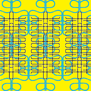
 This Pattern was created using the same "architecture" serif font as was used in one of my previous posts. I transformed the "a" and the "t" in this pattern. The "a" was copied and rotated to connect the arms, then reflected as a group and lined up along the backs of the "a". That whole Group was then rotated 180deg. again and lined up along the feet of the "a"s. This grouping was then dupicated and repeated, then scaled up so it fit the entire page. I decided to have the letters bleed off the sides to suggest a horizontal continuation of the pattern. The "t" was handled similarly to the "a." The letter was first reflected and connected at the crosses, then that shape was rotated 180deg. and connected at the tops/bottoms. I then took the two "t" group which was joined at the crosses and rotated it in two copies, 90 deg. and 270 deg. This was then connected to the outside of the crossbars of the upright "t"s. This pattern was again copied and repeated vertically. I scaled this to fit inside of the boundaries of the existing "a" pattern and copied that three times so that it would progress, again, horizontally across the page. This pattern also bleeds to the left and right, reinforcing the feeling of horizontal continuation. With the colored pattern I was able to use a different fills in order to differentiate these patterns. I felt that with the black and white they blended together more into on pattern and I was able to use the color in the fill to illustrate the layers of the pattern while still using the stroke to illuminate the individual letter that the pattern was made up of.
Tuesday, September 13, 2011
Tuesday, September 6, 2011
Thursday, September 1, 2011
Subscribe to:
Comments (Atom)


