Tuesday, November 29, 2011
Logo Design
For This exercise I used several different techniques to create a logo for the linear gallery. The first was to use the actual letters that make up Linear and Gallery, and to combine the words along the shared A in both words. I did this by using a horizontal and vertical text, and differentiating the typeface and the specifics of that typeface to separate the two words further. I then used linear bands of color to both reinforce the idea of the gallery and the word differentiation. Next I took a similar approach but extended the I in Linear down so that it became the baseline for the word Gallery. I again used color to iterate this design and see how effective it could be. Next I took that idea again but instead of extending the "I", I simply enlarged the entire word Linear so that the word Gallery could fit inside the I running vertically. The colored iterations became bland so on the last one I added a gradient to the word gallery to make it pop more within the I. Next I used the shape of the L in linear to hold both words, Linear is read without the L in the top because of the L in the design. The L, by housing both letters, gives a feeling of two linear hallways filled with the words. Next I used the actual image of the Linear Gallery to create the logo, the lines on the sides representing the solid of the bays, and the dark shadows on the bottom that they cast with the words "linear gallery" where the end of the gallery would be. I had originally wanted to make the words skew in perspective opposite the bays but I could not figure out how to do this in Indesign. Lastly I used the linear Gradient on the word linear to make the word fade and had the constant Gallery underneath at a smaller height. I then played with the stroke color and weight to give a reversal feeling to the word linear instead of it just fading out.
Tuesday, November 22, 2011
Lasercut Model Transformation
For this part of the project, I took the model from the last exercise and continued to modify it, albeit marginally . From there, in order to model the digital representation in a physical manner, I took a series of section cuts through the digital model. I then arranged the section cuts so that they would read from left to right as lowest to highest cut. I had to make separate section cuts for the displacement surface and the solid masses that were in the digital model so there are three varieties of section cut which are organized. I then took those section cuts into AutoCAD so that I could lay out the cuts that were necessary to make the physical model. It was at this point that I wanted to make a model where these section cuts were just etched into plexiglass and those layers of plexiglass then stacked on one another so that the canyons of the digital model would now read as something very different in this next physical iteration. I unfortunately did not have any plexiglass when this occurred to me so I was unable to make that model for class, though it is still my intention. The solid forms that are seen in the digital model would then stay as chipboard solids to keep the contrast between them and the canyon like displacement map that the digital model shows and then they would still be able to sit atop those canyons also like the digital version. It would be interesting to even cut the plexiglass all the way through for the exercise, but retain the square profile all the way up so that the cuts read better through the plexiglass from every angle, instead of being disconnected etches that would be somewhat difficult to read. For the process pages, I started with the two views from last time of my updated model and then zoomed out progressively, showing the model in wireframe with the section planes around it from a top view, and a wireframe axon with only the planes, before the sections were cut. I finished with a side view of the wireframe to show all of the plane cutting through the model, and all of the layers that the physical model will have. Each image is 4" tall and is fitting into a 4X8 zone with exception to the bottom picture which takes up a 4X16 zone. This was done so that the images would read clearer and for consistency across the page. Notice how the views zoom out progressively down the page and while the top images do not necessarily reference the two below them, they give a starting point for each half of the pages reading. The final wide-view image ends both columns simultaneously and balances the page out.
Thursday, November 10, 2011
 |
| original image |
 |
| processed image |
 |
| artificial light 1 |
 |
| artificial light 2 |
 |
| hybrid 1 |
 |
| hybrid 2 |
 |
| distant 1 |
 |
| distant 2 |
 |
| hidden line axon |
Thursday, November 3, 2011
Portfolio and Resume


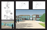
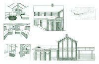
For my portfolio, I divided the page up into a grid of 9 equal sectors and from there used one or multiple sector for each image that was shown and one sector was reserved for text. Images that were given hierarchy were not only larger in this case, but were seen breaking the grid by taking over multiple sectors, creating multiple levels of hierarchy. The background for my first page was black due to the bright colors presented by the perspectives and aerial views and in order to allow the sections and plans to read more balanced with those perspectives. On the next spread, a black background would not have suited the grayscale rendered images and would not have allowed the bleeding white of the perspectives to work effectively so the background remained white. In my resume, I used the same sectors and actually used that space to include the cover letter and statement of intent so that the resume would be folded into a tripartite paper and the statement of intent would read on the front, with the rest of the resume on the interior.
Subscribe to:
Comments (Atom)


